In a digital world where image reigns supreme, the quality of your visuals is no longer an option, it's a necessity. For managers of SMEs, startups or VSEs, every detail of your visual identity must speak of professionalism and attention to detail. Yet all too often, visuals produced in-house or by less experienced service providers suffer from a lack of realism, particularly when it comes to integrating elements into mock-ups or presenting products. A poorly managed drop shadow can discredit a presentation, make a product less tangible, and give an unflattering "homemade" impression. This article will provide you with concrete methods and professional tips for creating realistic drop shadows in Photoshop, transforming the perception of your visual supports and reinforcing your brand's image.
Observing the light: the secret of the right shadow
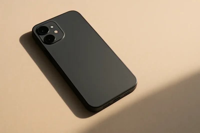
To create a drop shadow that sounds right in Photoshop, the first step is to understand how light and shadow interact in the real world. This is more an observational skill than a software technique. Before you even open Photoshop, take a few seconds to observe an object under different light sources, whether it's your phone on your desk in the Parisian daylight or a product in a shop window. Note the direction of the shadow, its sharpness, degradation and color.
- Direction: The shadow is always projected away from the light source. If the light is coming from the top left, the shadow will go to the bottom right.
- Sharpness : The closer the object to the surface and the smaller the light source, the sharper the shadow. The further away the object or the larger the light source, the softer the shadow.
- Intensity and color : A shadow is never a simple flat black. It's darker near the object and softer further away. It can also take on a slight tint of the surrounding colors or of the surface on which it is projected.
Master the fundamental tools of Photoshop
Forget the default "Drop Shadow" function in Photoshop layer styles for realistic rendering. It's too generic and lacks subtlety. For a professional result, you'll need to create your shadow manually, giving you total control over every aspect.

- Duplicate your object layer: Select the object for which you want a shadow (your product, a model, a logo, etc.). Duplicate this layer (
Ctrl/Cmd + J). - Turn the shadow into black: On the duplicated layer, fill the object with pure black (
Alt/Option + DeleteorShift + Alt/Option + Supprafter defining black as the foreground color). - Distort the shadow: Use the Free Transform tool (
Ctrl/Cmd + T). Right-click and select "Distort" or "Perspective". Modify the shape of the black layer to match the realistic projection of a shadow based on your imaginary light source. Think about angle and distance. - Blur the shadow: Go to
Filter > Blur > Gaussian Blur. Apply a suitable blur radius to soften the edges of the shadow. Start with a small value and gradually increase. - Adjust opacity and blend mode : Reduce the opacity of the shadow layer (often between 30% and 60%) and change the blending mode to Multiply. This allows the shadow to blend naturally with the background colors.
Fine-tuning realism: gradients and noise
A realistic shadow is not uniform. It's denser and more defined near the object, then fades and softens as it moves away. To simulate this, we'll add a gradient to your shadow and a slight noise to break up the digital perfection.

- Density gradient : Add a blend mask (rectangular icon with a circle inside) to your shadow layer. Select the Gradient tool (G) and apply a linear gradient from black to white on the mask, from the end of the shadow towards the object. This will gradually make the shadow disappear. You can also use the black brush on the mask to blur certain areas.
- Blur gradient : For an even more natural blur, duplicate your main shadow layer. Apply a stronger Gaussian blur to this new layer, then use a blend mask to reveal this blur only on the areas furthest from the object, leaving the more subtle blur close to the object.
- Adding noise : To break up the overly smooth, digital look, add a slight noise. Select your shadow layer, then go to
Filter > Noise > Add noise. Use a small value (1-3%) with "Gaussian" distribution and check "Monochromatic" to avoid colored artifacts. This mimics the slight imperfections of real light.
| Features | Default drop shadow | Refined hand shadow |
|---|---|---|
| Sharpness | Uniform and often too hard | Variable, sharper near the object, softer further away |
| Perspective | Generally straight, does not fit well | Deformable to align with surface and light source |
| Color/Density | Flattened, often gray or pure black | Variable, takes the environment into account, with subtle gradations |
| Perceived realism | Weak, clipart look | High, adds depth and professionalism |
The impact on your brand image
Attention to detail like a realistic drop shadow transcends mere technique: it's a marker of your brand's overall quality. For an e-commerce startup in Paris selling handcrafted products, product photos with well-executed shadows give the impression that the product is real, tactile, and made with care. This contrasts sharply with a product that appears to be "floating" on a white background, a sign of amateurism.
- Increased credibility : Meticulous visuals boost your customers' confidence.
- Professionalism : They show that your brand has mastered its image and leaves nothing to chance.
- Differentiation : In a saturated market, the level of detail in your visuals can set you apart from the competition.
- Product enhancement : A well-placed shadow adds depth and volume, making the object more attractive.
Conclusion
In today's visual ecosystem, the perception of your brand is directly influenced by the quality of your graphic media. Often underestimated, drop shadow plays a fundamental role in creating depth, realism and, ultimately, credibility for your visuals. As an executive, investing a little time in understanding these principles, or entrusting this task to experts, is an investment in your company's brand image. Never underestimate the power of details: they transform functional images into memorable visual experiences.
The concrete takeaways are clear: observe the light, use Photoshop's transformation and blurring tools with discernment, and refine your shadows with gradients and noise for maximum realism. The aim is always to give the impression that your object is interacting naturally with its environment.
If the complexity of Photoshop tools or the time required to make these adjustments don't fit into your busy schedule, know that experts like Altay Dagistan are there for you. Specializing in branding, visual identity and web design in Paris, we ensure that every detail of your visual presence is impeccable, allowing you to focus on growing your business while guaranteeing an impeccable image.
https://unsplash.com/@1clickaf