Creative Works by
Altay Dagistan
Graphic Designer & Web Developer from Paris.
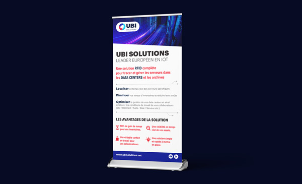
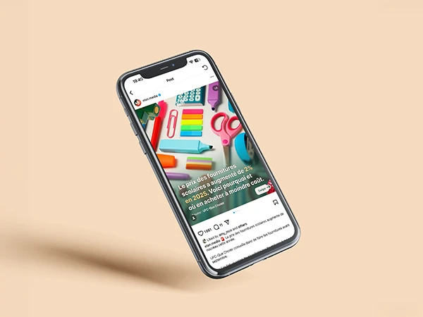
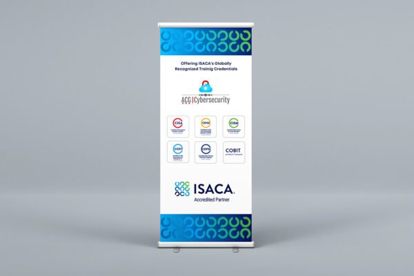
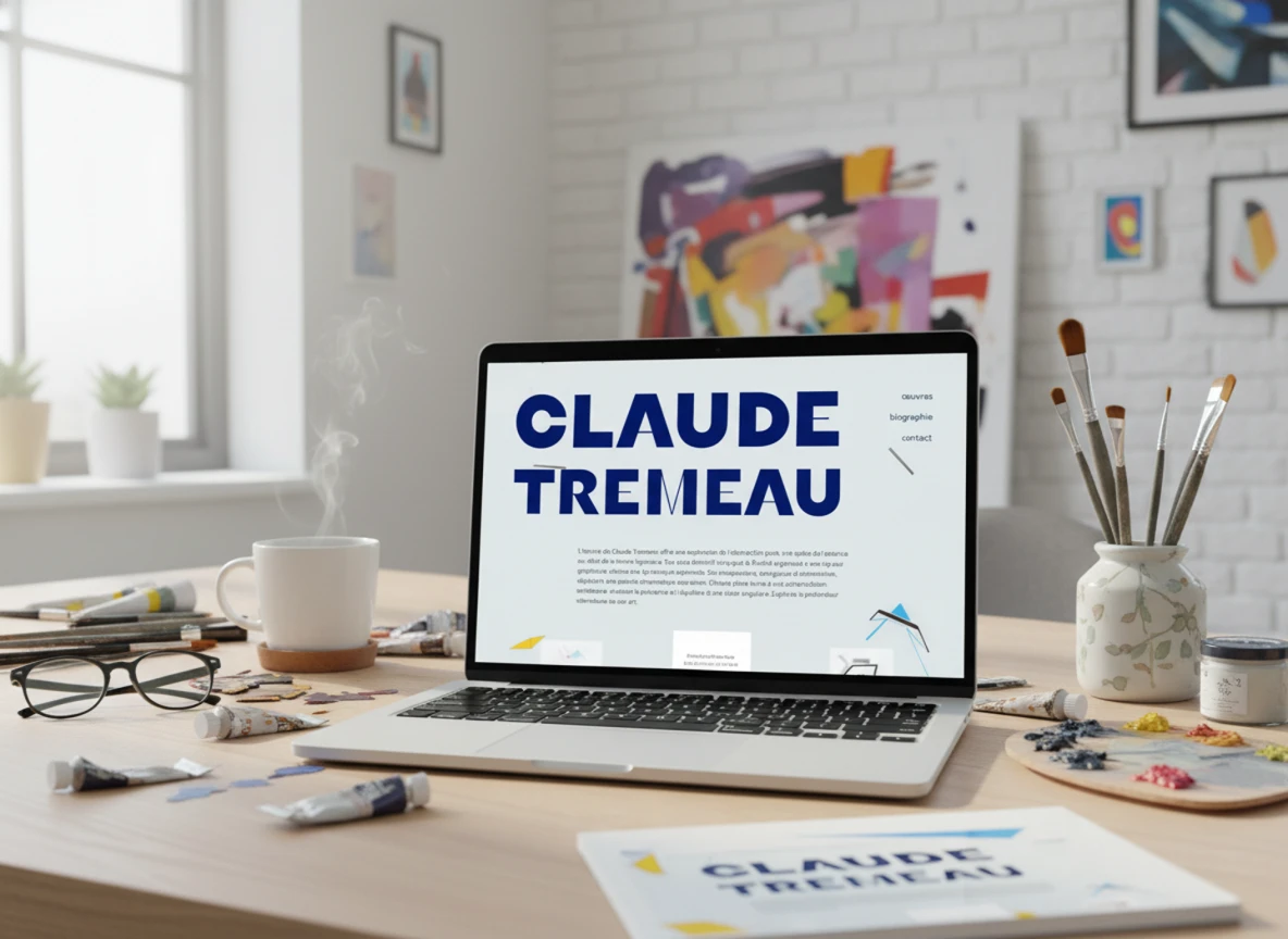
I create visual identities, websites and print media for brands and companies.
Portfolio
Areas of expertise
years of experience
Client testimonials

Cyrielle BERTHIER
Soletanche Bachy
I've been working with Altay for several years now, and hopefully for many more to come!

Caroline LABELLE-HUBERT
Break-Events
I've been working with Altay for 2 years now. In addition to the graphic qualities of his work, he is always ready to give good advice, is astute and doesn't hesitate to do research to find the best solution for our needs.

Arthur MEGNIN
Kalikado
A consistently professional and pleasant contact, coupled with a remarkable responsiveness in all situations. Always a pleasure to work with Altay!
Contact
Starting a new project or updating an existing design?
Use this form for any questions you may have. Response times are usually short.
years of experience
projects delivered
Happy Customers


