
SaaS B2B · Page structure
How to structure a B2B SaaS homepage
A SaaS product can be sophisticated without its homepage needing to be. The work is to order the promise, the proof and the action, in that sequence, before thinking in sections or features.
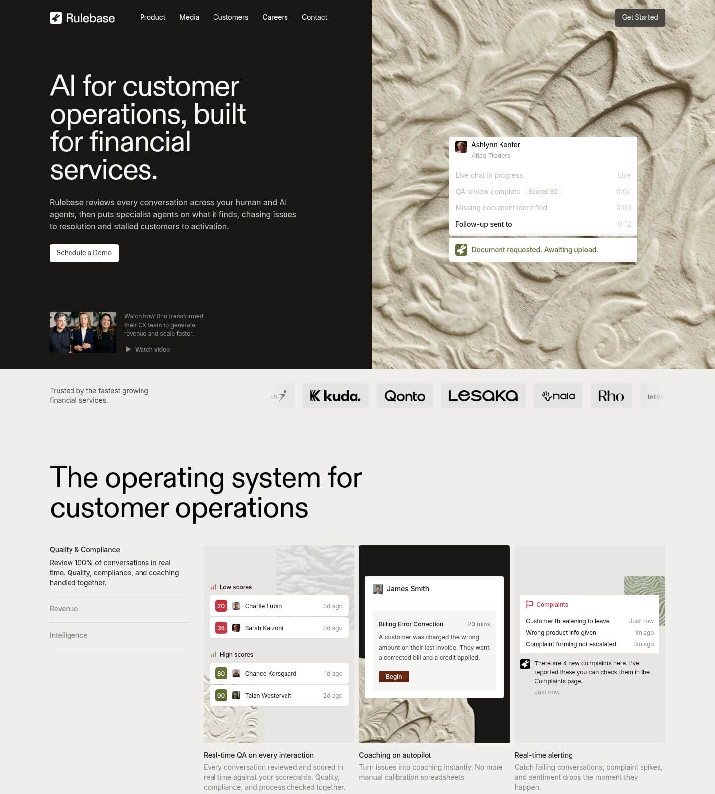
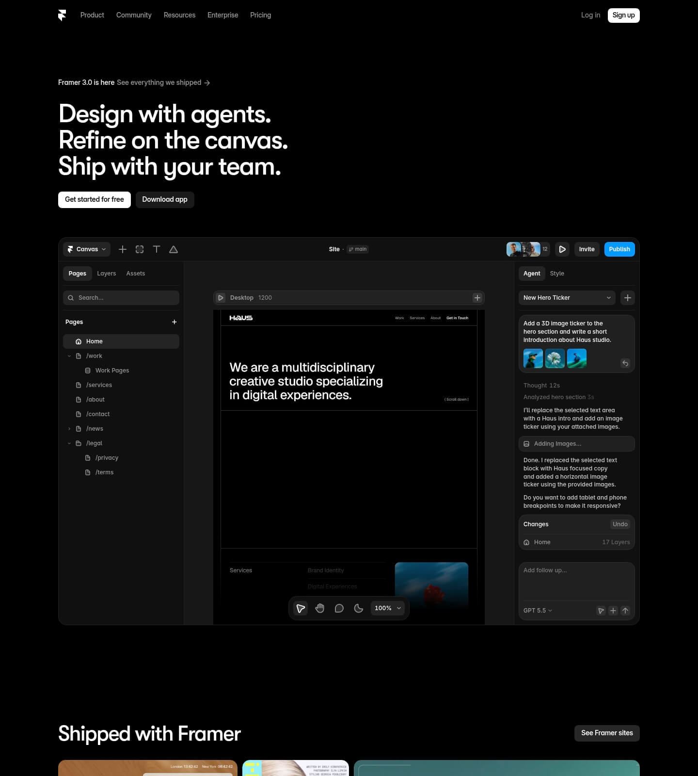
What the first screen must accomplish
A visitor who lands on a B2B SaaS homepage knows neither the product nor the company’s internal vocabulary. Three things need to be understood before they scroll past the first screen.
The anatomy of a B2B SaaS homepage
Content matters less than the order it appears in, and that order changes depending on how the product is sold. Compare the two models below.
Some sections can be merged or reordered depending on the product’s maturity, but the logic stays the same: context before mechanics, proof before asking for commitment.
The product as proof, not as a catalog
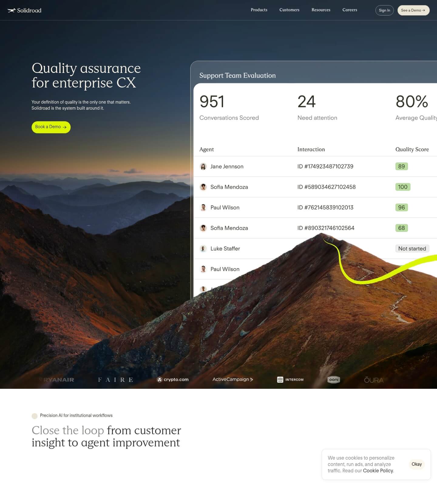
A common mistake is treating the homepage like a technical manual: every feature gets its own card, icon and sentence. The visitor is then left to work out the point of each one alone.
An interface carries more weight when it’s tied to a specific task rather than a list of options. On an interface project such as the design of a recruitment platform, the screen’s hierarchy follows a real use case, not the list of available functions.
Self-serve or sales-led: a different structure
A SaaS homepage’s structure changes with the sales model. A self-serve product and one sold through a sales demonstration don’t tell the same story in the same order.
| Criterion | Self-serve | Sales-led |
|---|---|---|
| Primary CTA | “Free trial” or “Get started” | “Request a demo” |
| Pricing | Visible, often in the menu | Rarely shown, quote-based or revealed after a conversation |
| Product proof | Screenshots, product tour, sometimes an interactive demo | Sector-specific use cases, logos, testimonials |
| Page length | Shorter: the product does much of the explaining | Longer: context and proof do the work the product can’t do alone |
| Role of the copy | Minimal, guides toward the trial | More developed, prepares the sales conversation |
The diagnostic below gives a first read, to refine based on your market and average price point.
The mistakes that break the reading flow
Some mistakes come up more often than others, and on their own are enough to break the reading flow of an otherwise well-written homepage.
- A feature list shown before the problem being solved is clear.
- An action button that changes label in every section (Trial, Demo, Contact, Quote).
- The product only appearing at the bottom of the page, after several screens of text.
- No proof, logo or use case, before the first screenshot.
- A page designed for a single profile when both a technical reader and a decision-maker are reading it.
What you need before writing the homepage
Before writing the first word, a few things make the work easier: a product demo, the two or three most frequent use cases, and a clear idea of the next action expected from the visitor.
Is your homepage struggling to explain your product?
I design B2B SaaS websites where the promise, the proof and the action are ordered before they’re styled.
Explore B2B SaaS web design →