
sales brochure · Guide
What should be found in a good B2B sales brochure
An effective sales brochure is not just about a beautiful design. It responds to a precise logic: capture attention, qualify the offer, convince, and encourage action. Here are the essential elements, in order.
🧠 Logic before content
A B2B brochure does not work like a general public brochure. It is read in a specific context: after a first contact, during a meeting, or transmitted to a decision-maker who has never met you. The reader has no time. He quickly seeks to understand what you do, for whom, and why you rather than someone else.
The structure should follow a logical progression: hook, qualify, prove, incite to act. Each section has a role. A brochure where everything is treated at the same level of importance retains nothing.
📋 The 6 essential sections
📊 Visual hierarchy: what the prospect really reads
In a B2B context, the brochure is rarely read from start to finish during a first contact. The actual reading order follows visual scanning logic.
Typical reading order of a B2B brochure (% of readers reaching each area)
What this actually implies: your offer and your differentiation must be visible without opening the brochure. The cover and the spine should be enough to make you want to open it.
✅ What works vs. what harms
| Element | What works | What harms |
|---|---|---|
| Text | Short, customer benefit oriented | Long paragraphs, internal jargon |
| Visuals | Real photos, product captures, infographics | Generic stock photos, decorative illustrations |
| References | Recognized customer logos, verifiable figures | Anonymous testimonies, unsourced figures |
| Structure | Clear hierarchy, explicit titles | All at the same level, linear reading imposed |
| Contact | Direct email, number, QR code to site | Online contact form only |
| Format | Interactive PDF + identical print version | Unoptimized PDF, low resolution images |
⚙️ Common errors in a B2B context
-
Talk about yourself rather than the customer. “We have specialized for 20 years in…” is less interesting to the prospect than “Our clients reduce their processing time by 40%. »
-
Put everything in the plate. A brochure is not a catalog. If you have 12 offers, create a brochure per customer segment rather than a general brochure that doesn't speak to anyone.
-
Neglect the back of the plate. In 3 sections, the back is often left empty or used for legal notices. However, it is the last surface seen before the prospect puts the plate away.
-
Create a plate that ages quickly. Avoid mentioning prices, dates or recent news. A well-designed brochure remains relevant for 2 to 3 years.
-
Deliver a file not optimized for printing. An RGB PDF with images at 72 DPI will produce a disappointing result when printed. Files must be in CMYK, 300 DPI minimum, with bleed.
🗂️ Examples of achievements
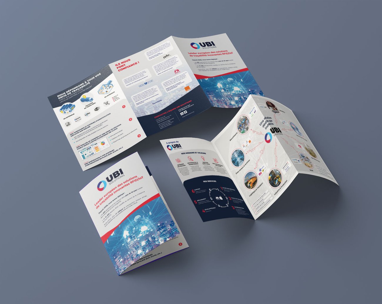
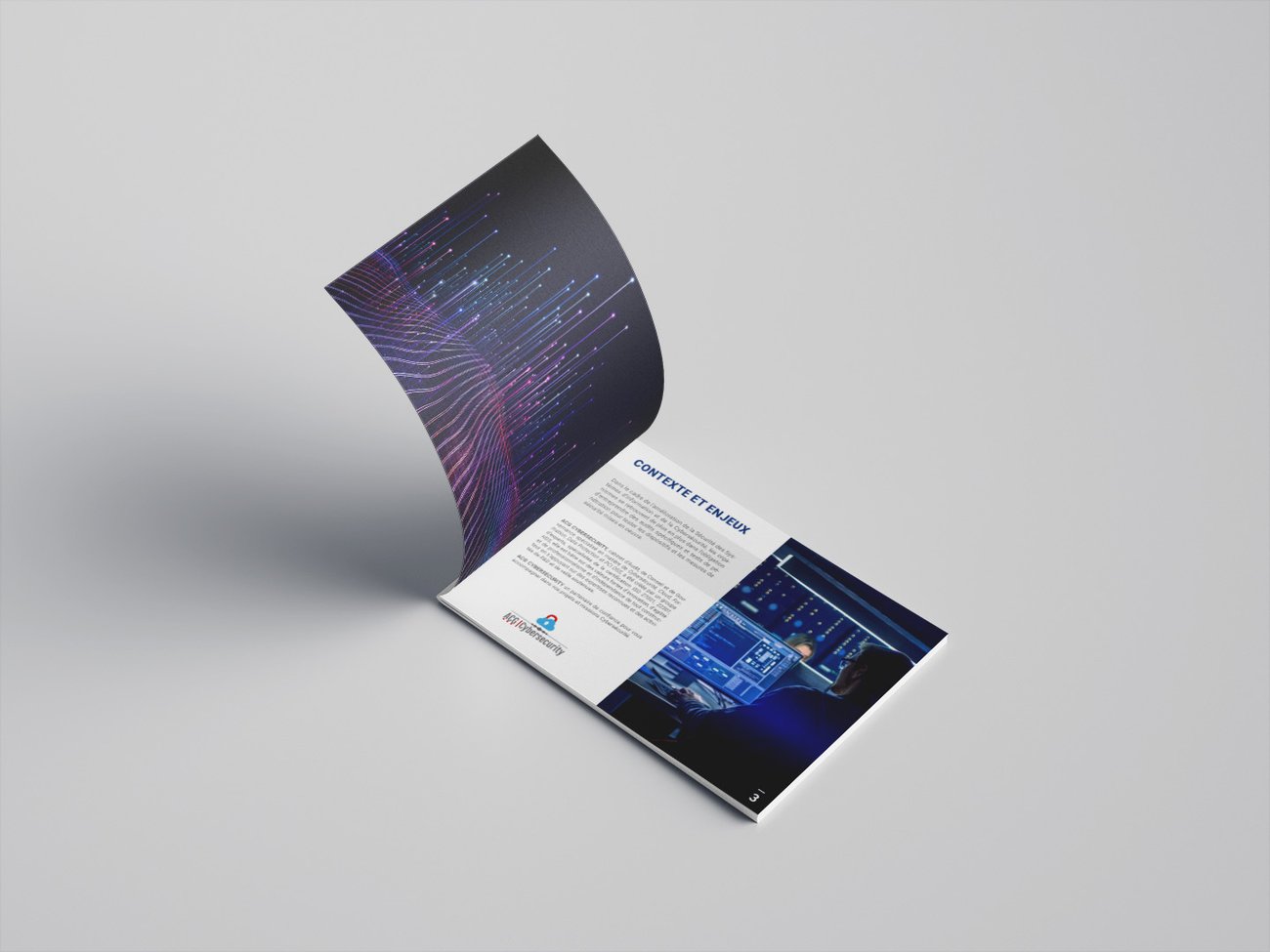
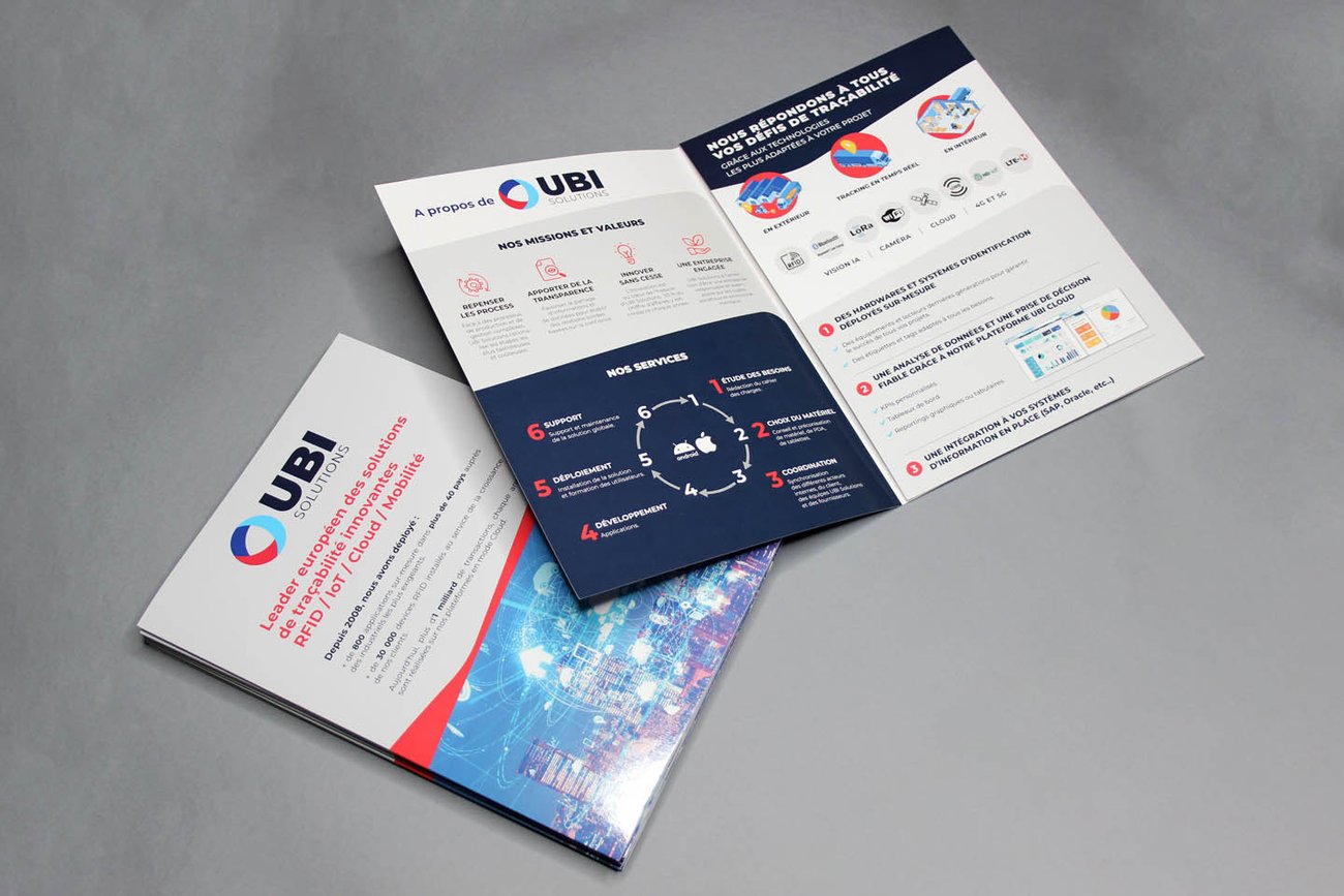
Commercial brochures created for B2B clients with these principles applied.
📌 What to remember
An effective B2B brochure is not the most beautiful - it is the one that fulfills its role: transmitting the right message to the right person, without requiring effort. Clear structure, explicit benefits, concrete evidence, visible contact.
The design amplifies well-structured content. If the content is blurry, no amount of graphics work will make up for it.
Do you have a sales brochure project?
Custom creation for B2B companies — quote within 24 hours.
See the brochure page