
Case study · website redesign
maire-info.com
Maire info
Rethinking the daily digital briefing of local elected officials
Art direction · UX/UI design · editorial web design
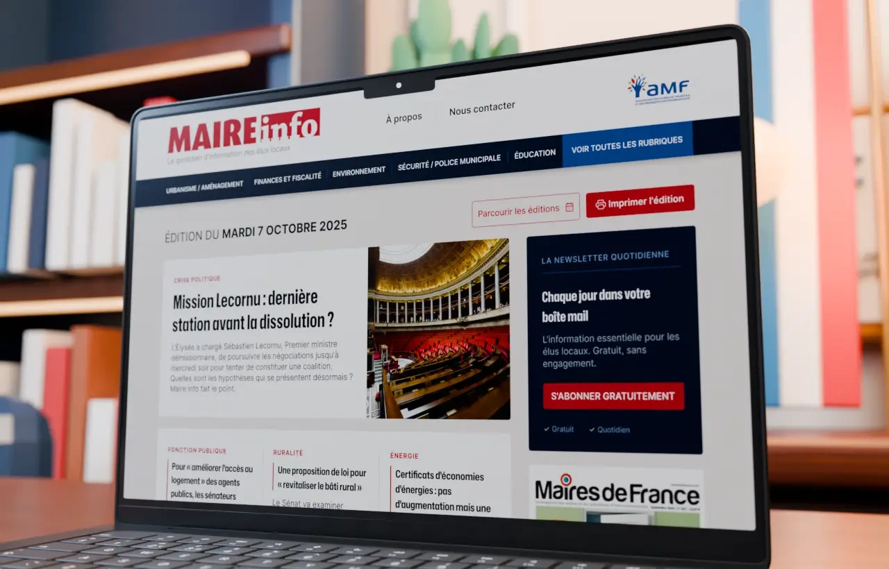
Maire info is the daily news service of the Association des maires de France, written for local elected officials and everyone working inside French local government. For this redesign proposal, the challenge was to modernise a site with very high editorial density while preserving its institutional cues and the depth of its archive.
The objective: make the day's news immediately identifiable, make topics easier to explore, and build a reading experience that is clear, consistent and matched to the publication rhythm of the title.

01 / Edition
A homepage built like a daily edition
The homepage is organised around the date and the lead story. The front-page article holds the centre, supported by a selection of secondary subjects and several levels of reading.
Most-read articles, the Journal officiel selection, news published on the AMF site and the Maires de France magazine all sit inside one modular composition. Every block has a clearly identifiable function, so a reader can scan the whole edition quickly or stop on a single subject.
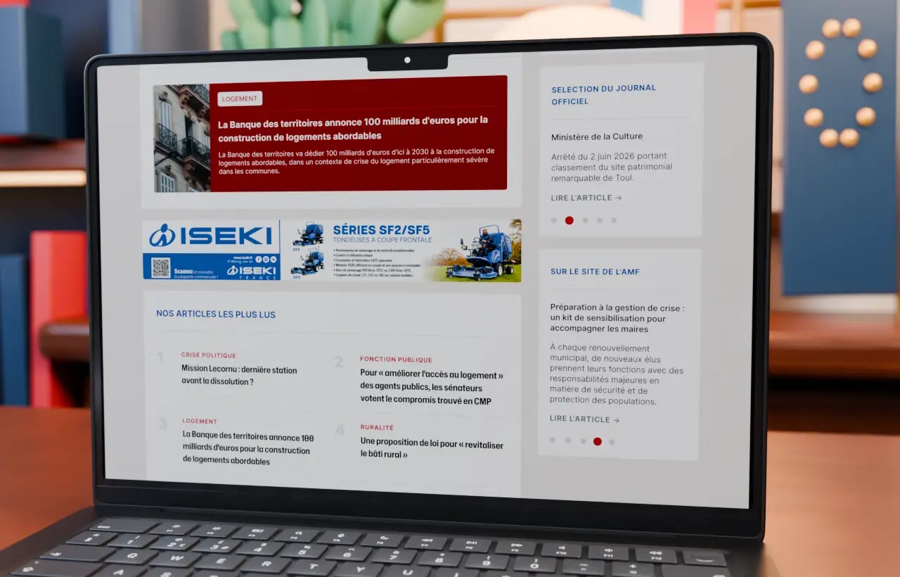
Blocks of the edition
- 01Date and edition
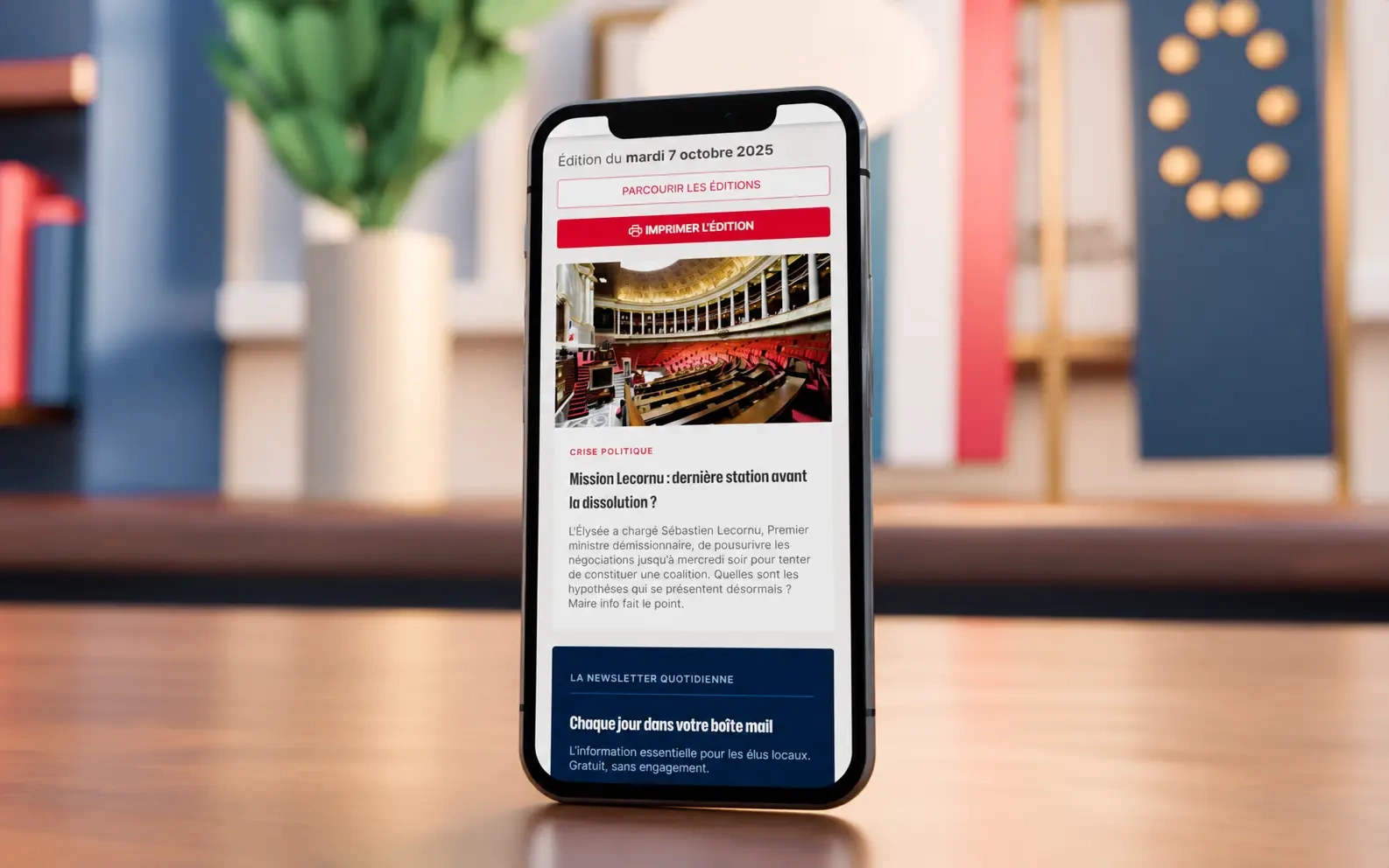
The day is stated first, with the previous editions and the print view kept in view.
- 02Front-page article
A central position, a single subject, one clear entry point into the day.
- 03Most-read
A ranked list that reveals what the readership is actually following.
- 04Journal officiel
The regulatory selection, treated as a service rather than as a sidebar.
- 05AMF news
Association content presented as part of the same editorial flow.
- 06Maires de France
The magazine kept visible as a natural extension of the daily title.
Access to previous editions and to the printable edition stays visible from the very start of the journey, preserving the habits specific to a daily institutional publication.
02 / Before / after
What the redesign changes
The existing site carries a genuinely rich archive inside a layout that flattens it. The proposal keeps every function and gives each one a readable position.
Homepage
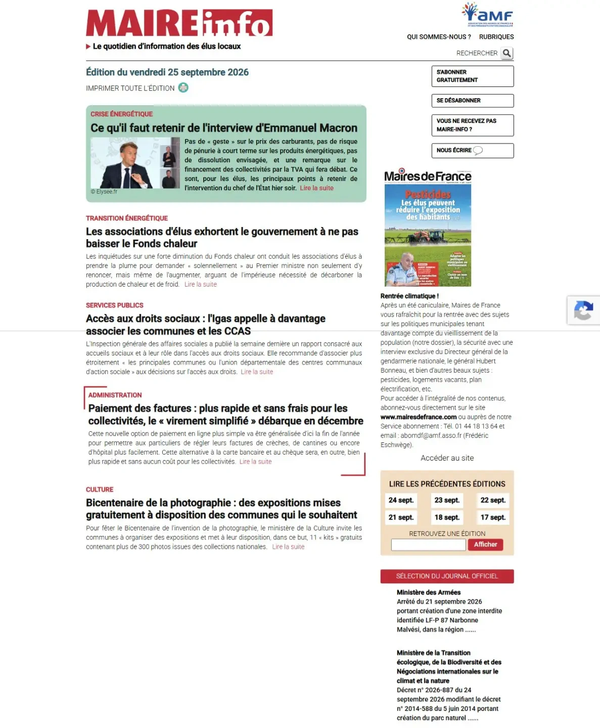
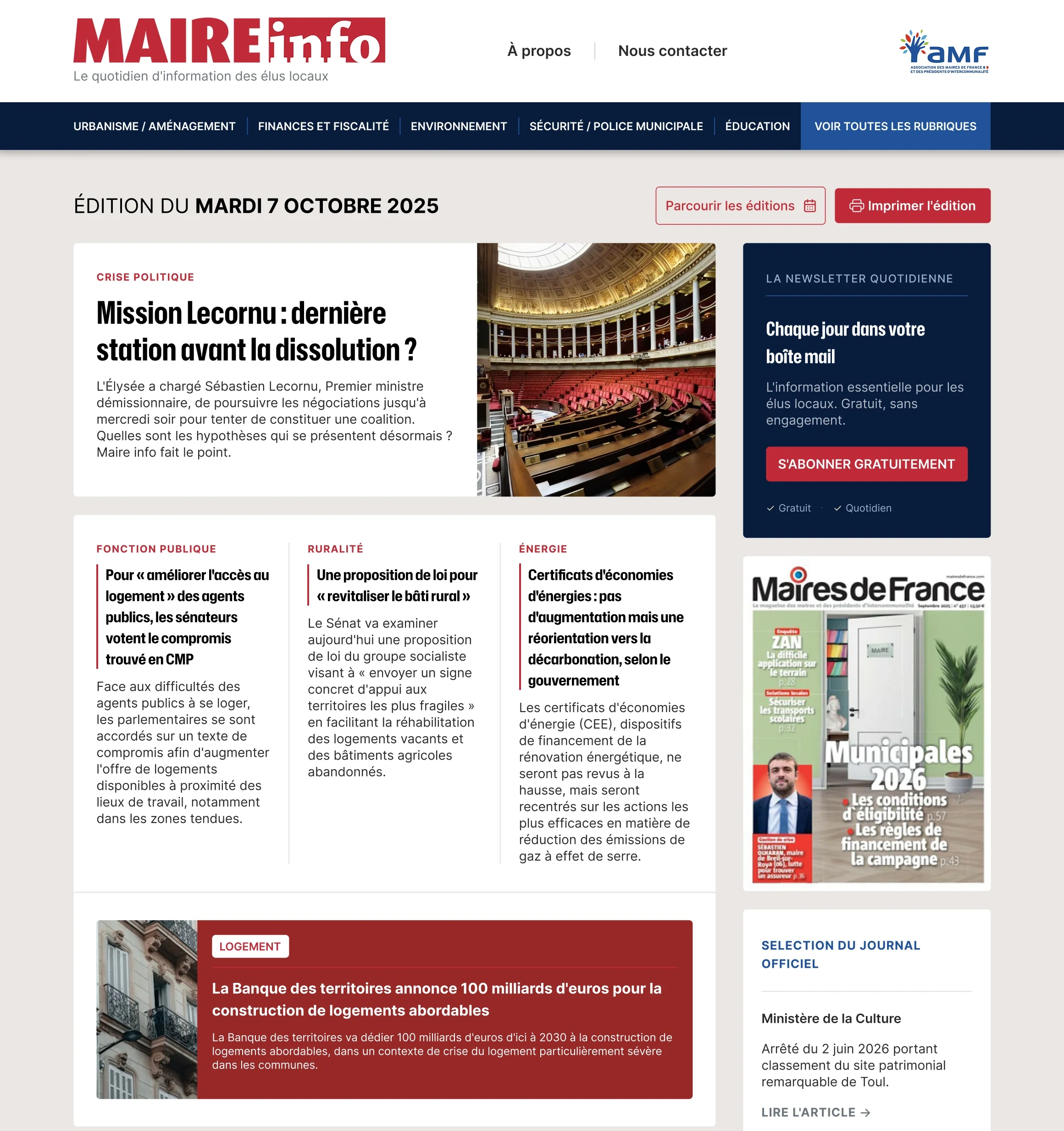
The same edition, reorganised: a dated masthead, a lead story with real presence, secondary subjects on a legible grid, and the newsletter and magazine held in a stable column.
Topics index
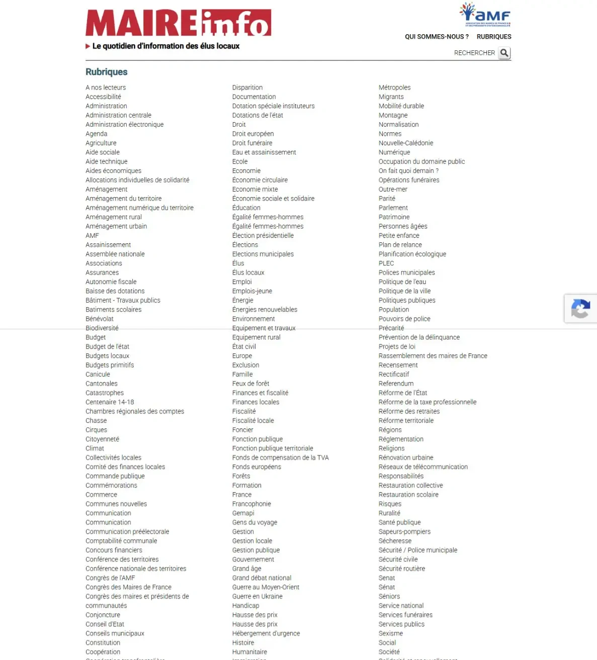
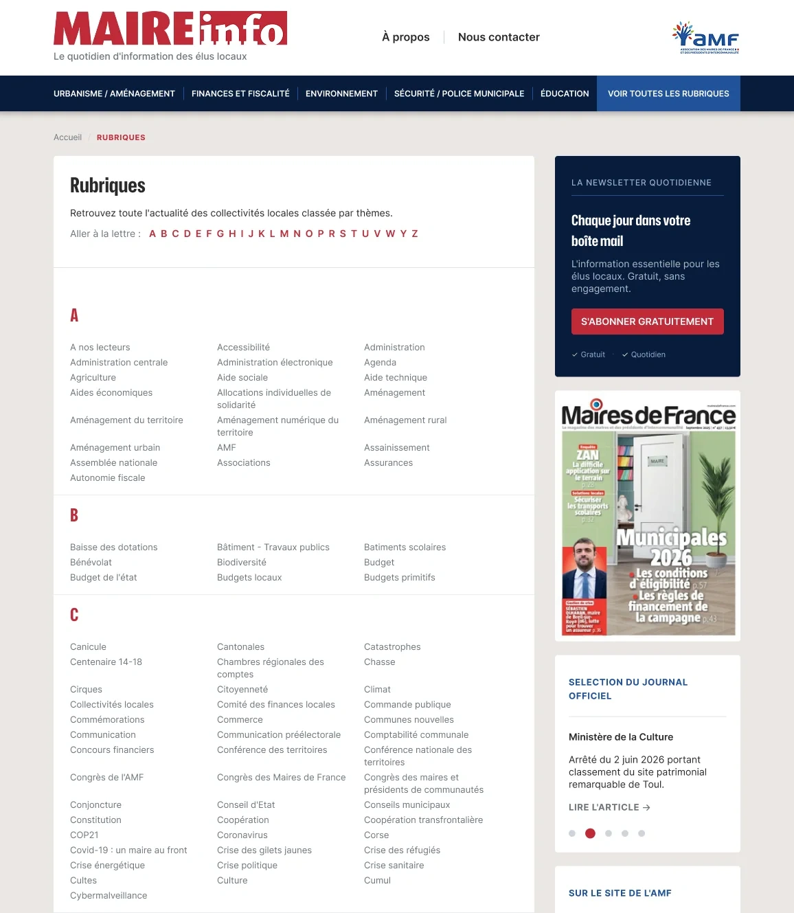
The same list of topics, given an alphabetical structure, jump-to-letter links and breathing room, instead of three uninterrupted columns.
03 / Navigation
Opening up a very dense body of information
Navigation was rebuilt to make the main themes immediately reachable: public service, rural affairs, energy, environment, finance, security, education and regional planning.
A dedicated topics page gathers every subject as an alphabetical index. That organisation makes a particularly rich archive explorable without overloading the primary navigation.
Main themes
- Public service
- Rural affairs
- Energy
- Environment
- Finance
- Security
- Education
- Regional planning
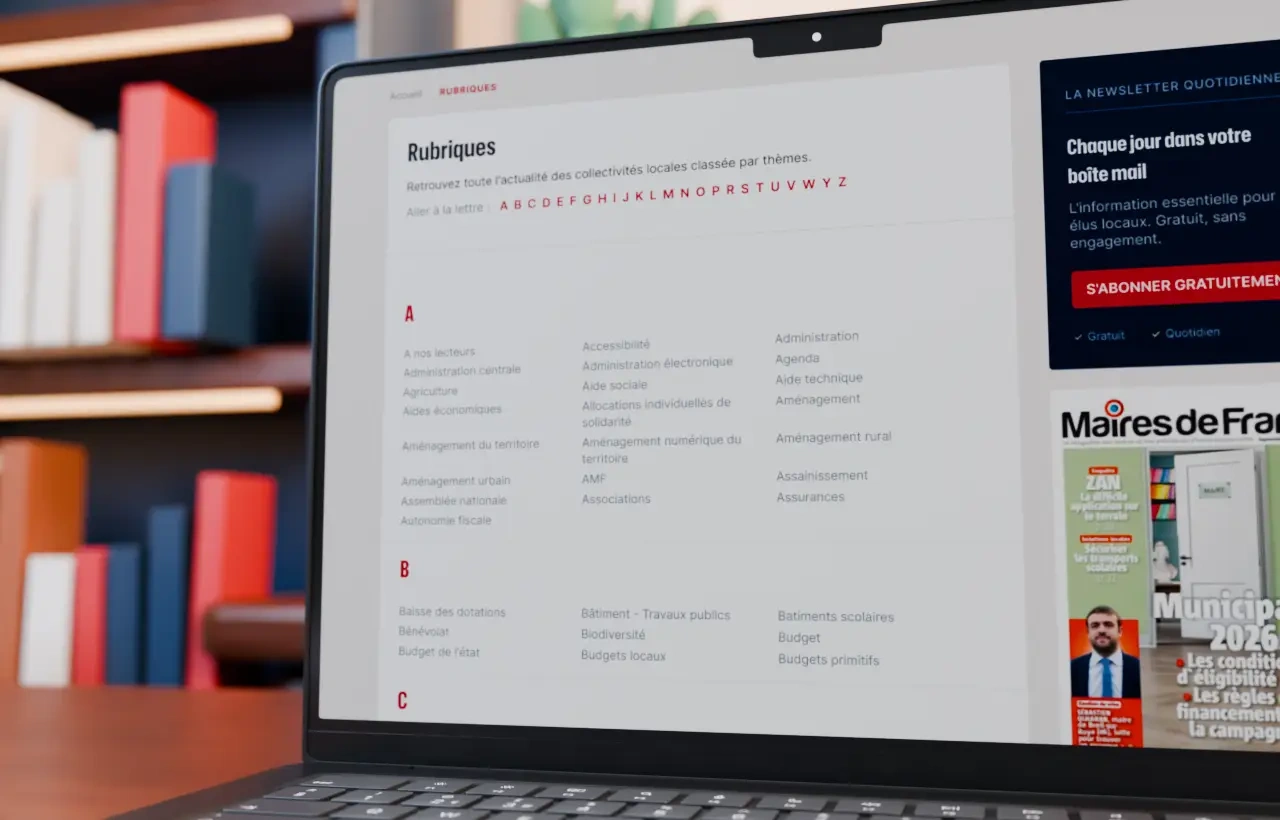
- Reach a theme
The main themes are one click away from any page.
- Explore the archive
An alphabetical index carries the long tail without crowding the menu.
- Read without friction
A stable reading order from category to body text, on every article.
Article hierarchy
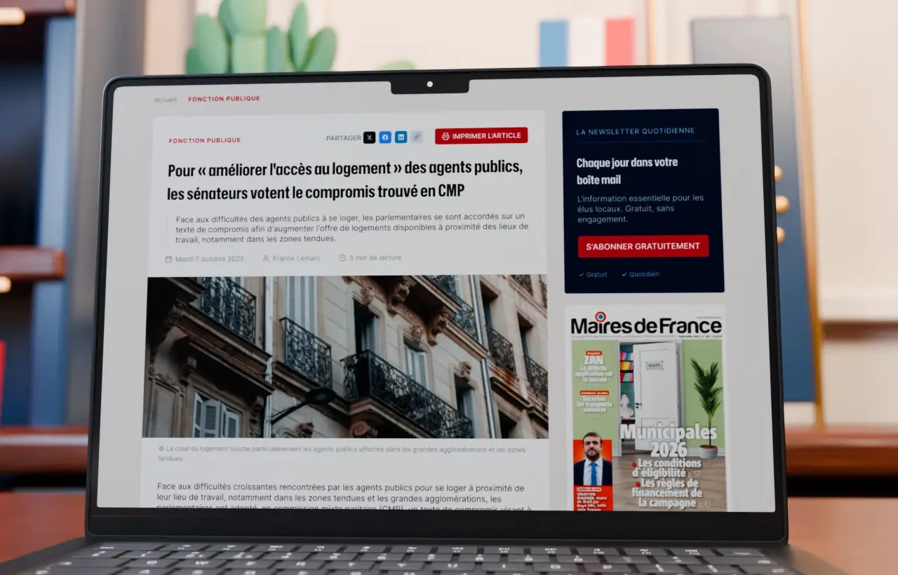
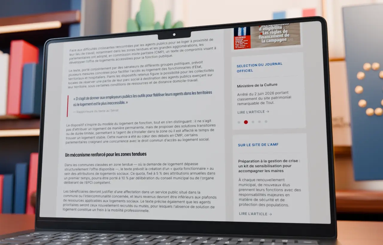
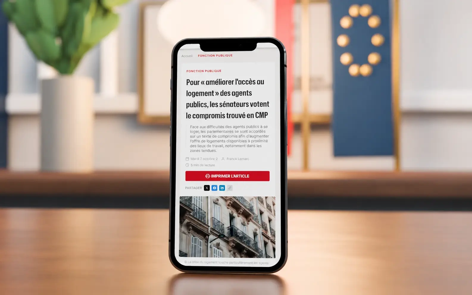
On article pages the hierarchy is built for reading comfort: category, title, introduction, publication details, lead image, then the body of the text.
- 01Category
- 02Title
- 03Introduction
- 04Publication details
- 05Lead image
- 06Body text
Share and print actions stay available, but quiet enough not to pull attention away from the content.
04 / Art direction
An institutional and contemporary visual identity
The art direction is built on the historic colours of Maire info and the AMF. Deep blue structures the interface and asserts its institutional dimension. Red signals categories, important actions and calls to action.
Light backgrounds, generous spacing and typographic contrast give the whole more room to breathe. The typography, drawn from the world of the press, sets a sharp hierarchy between headlines, practical information and reading content. Components stay sober and functional so the information keeps the foreground.
Palette
#0B1D39Deep blue: structures the interface and carries the institutional register.
#BB2C38Red: signals categories, important actions and calls to action.
#EBE7E3Light background: the paper ground that opens up the reading space.
#FFFFFFWhite: reading surfaces, cards and article columns.
Editorial hierarchy
Category
Public service
Headline
Senators vote the compromise reached in joint committee
Standfirst
Faced with the housing difficulties of public-sector staff, parliamentarians agreed on a text intended to increase supply near places of work.
Details
Tuesday 7 October · 5 min read
05 / Services
Turning complementary services into landmarks
Signing up to the daily newsletter is given a constant, easily recognisable position. It accompanies navigation without interrupting reading, and restates the essential promise of the service: receiving the information local officials need, every day.
AMF content and the Maires de France magazine are integrated with the same logic. They become natural extensions of the editorial experience rather than peripheral elements.
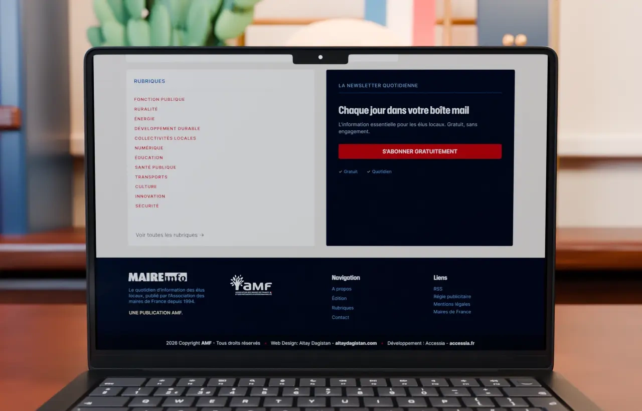
- The daily newsletter
One constant position, one promise, one action. Present across the journey without ever blocking the reading.
- AMF and Maires de France
Association content and the magazine become extensions of the edition, not appendices to it.
06 / System
A coherent editorial system
The homepage, the topics index, the articles and the footer were designed as a set of complementary templates. That consistency lets the site carry different volumes and formats of content while keeping stable visual landmarks.
The proposal therefore offers a more current expression of Maire info: a structured institutional publication, immediately identifiable, designed to be consulted daily for the news of French local government.
Templates
- 01Homepage
The daily edition and its levels of reading.
- 02Topics index
The alphabetical entry point into the archive.
- 03Article
The reading page and its publication details.
- 04Mobile
The same hierarchy, on the format read most often.
Conclusion
A daily publication, made legible again
The value of the proposal is not in any single screen. It is in the relationship between them: one edition rhythm, one navigation logic, one palette and one hierarchy, applied consistently enough that a reader always knows where they are.
Maire info keeps its institutional register and its archive. It simply gains the space needed to make them readable.
Discuss a projectMore projects
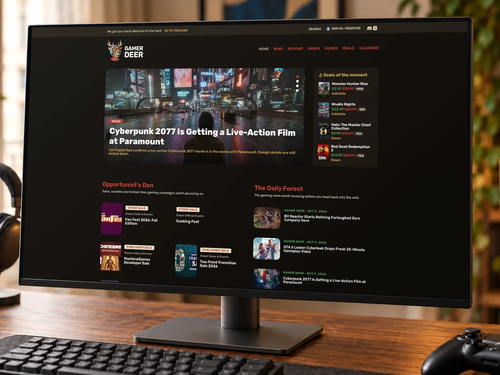
Gamer Deer: brand, product and independent gaming platform
Digital, Art direction, Brand identity, UI/UX design, Web design
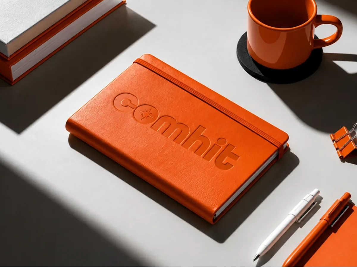
Comhit Agency — Visual Identity Design
Art direction, Brand identity
Design of the visual identity for Comhit Agency, a Paris-based agency specializing in communication solutions for trade shows and professional events. The identity is built around a distinctive symbol integrated into the “O” of the logotype, evoking a star, a compass, a meeting point and connection. Designed to work independently from the Comhit name, the symbol becomes a recognizable visual marker for the brand.
The visual system extends across typography, color palette, graphic compositions, and their print and digital applications. It supports Comhit across its different touchpoints, from exhibition stand signage and sales materials to digital experiences and lead capture journeys.
The overall identity conveys a brand that is human, dynamic and driven by interaction, while establishing a clear and distinctive presence within the B2B and events sector.