
Web Design · Practical guide
B2B landing page: structure of a page that converts
An effective B2B landing page guides a prospect from a specific promise to a clear action. Request for a demo, make an appointment, request for a quote, registration or download: its structure must help the visitor quickly understand where they are, what we are offering them, why it concerns them and why they can move forward with confidence.
In a B2B context, this progression is particularly important. The offer can be technical, the budget large and the decision rarely impulsive.
Here's how I generally structure this type of page.
Before structure: start with a single objective
A landing page works best when it matches an offer, a main target and an expected action.
Let’s take three campaigns:
- a campaign to obtain demos of SaaS software;
- a campaign to promote a cybersecurity audit;
- a campaign to generate quote requests for a consulting service.
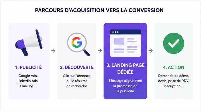
Visitors do not arrive with the same questions. The page must therefore continue the conversation started before the click.
An advertisement that talks about a cybersecurity audit for SMEs should lead to a page that immediately takes up this topic. Sending the visitor to a generic page presenting the entire company requires them to retrace their steps themselves.
01. The hero: immediately confirm that you are in the right place
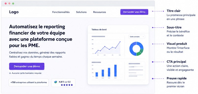
The first screen should answer three questions:
- What is it?
- Who is this for?
- What action can I take?
A good title therefore favors understanding.
Below the title, a few lines can specify:
- the problem addressed;
- the nature of the solution;
- the main beneficiaries;
- an important element of differentiation.
Then comes the main action:
The visitor must be able to understand the proposal before discovering the rest of the page.
02. Show that you understand the problem
Once the proposition is understood, the visitor generally seeks to know if it really corresponds to their situation. This is where the page can describe the problem more precisely.
For a SaaS platform, for example:
- data distributed across multiple tools;
- repetitive manual operations;
- lack of visibility;
- reporting difficult to maintain;
- complicated collaboration between teams.
The objective is to allow the right prospect to recognize themselves.
This part works well with three or four very concrete situations, rather than a long paragraph explaining that businesses face many challenges today.
The more identifiable the problem, the more relevant the rest of the page becomes.
03. Present the solution by what it allows you to do
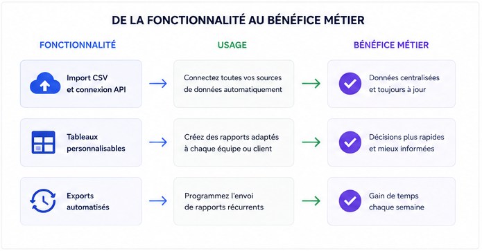
Next comes the value proposition. On complex B2B offers, a common mistake is to transform this section into a catalog of features.
Let's imagine software that offers:
- import CSV;
- API connection;
- customizable tables;
- automated exports;
- rights management.
This information is useful. But a decision-maker first seeks to understand what these features will change in your organization.
The presentation can therefore start from the uses:
Centralize data
Connect the different sources used by your teams in the same environment.
Automate reporting
Prepare recurring reports from fresh data, without manually rebuilding the same document.
Adapt access to teams
Organize information and permissions according to roles and business needs.
The functionality remains present. It is simply placed in context.
04. Show concretely what we are offering
A promise becomes much easier to evaluate when it takes a tangible form.
Depending on the offer, this section may show:
- an interface;
- a sample deliverable;
- the functioning of a product;
- the stages of a service;
- the modules included;
- a before/after;
- a dashboard extract;
- a short animation;
- a video demonstration.
For a service, I often recommend also specifying what is actually included in the service. For example:
This precision also helps to qualify requests. The prospect better understands what he can expect before even making contact.
05. Provide evidence at the right time
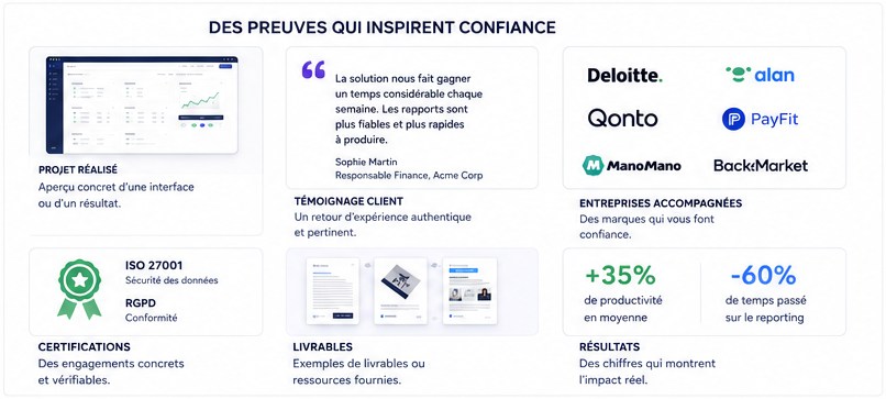
Evidence can take many forms:
- achievements;
- project captures;
- customer references;
- testimonials;
- certifications;
- sample deliverables;
- logos of supported companies;
- elements of method;
- documented results when they actually exist.
The choice depends on the service sold.
For a web design service, showing several relevant interfaces often provides more than a long statement on creativity.
For a SaaS product, showing the interface in situ helps make the solution concrete.
For a branding mission, the different applications of the visual system make it possible to assess the scope of the work.
06. Respond to objections before the form
An interested prospect may still be hesitant. The price is just one objection among others.
He may also wonder:
- how long the project will take;
- how the collaboration takes place;
- who should provide the content;
- whether its technical environment is compatible;
- whether the solution fits their business;
- what happens after delivery;
- how many people should be involved.
A good landing page anticipates questions that could block contact.
A section method, unfolding, FAQs or practical information can then reduce uncertainty.
For a B2B service, showing a simple process works particularly well:
Framing
Understanding the need and defining the scope.
Design
Structure, UX and visual direction.
Production
Creation and development according to the project.
Delivery
Validation, production and transmission of elements.
The process is reassuring because it makes collaboration predictable.
07. A main CTA, repeated in the right places
The button does not need to appear only once.
On a long page, the main action can be repeated when the visitor has enough information to move forward. For example:
- Hero → Request a demo
- After presenting the solution → Request a demo
- After proofs and answers to objections → Request a demo
It’s still the same goal. However, avoid transforming the page into a crossroads with:
- discover the company;
- read the blog;
- see all news;
- follow LinkedIn;
- consult ten other services;
- download a brochure;
- look at the portfolio;
- contact the team.
A successful landing page maintains a clear direction.

08. The form is part of the experience
A very elaborate page can lose some of its effectiveness with an unnecessarily complicated form. The number of fields must correspond to the actual need.
Conversely, only asking for an email address may be insufficient when you need to qualify a complex mission. The right balance therefore depends on what will be done with the demand. The rest can come later.
What length for a B2B landing page?
There is no ideal length applicable to all offers.
Registration for an event can be understood with a few blocks. Complex B2B software costing several thousand euros per year will probably require more explanation.
A strategic service may require:
- context;
- the method;
- deliverables;
- achievements;
- the progress;
- responses to objections.
A simple to use B2B landing page structure
For many projects, I start from this architecture:
Value proposition
A clear offer, an identifiable target and a main action.
Problem
The situations the prospect faces.
Solution
The way in which the offer concretely responds to these situations.
Benefits and uses
What the prospect can actually accomplish.
Demonstration or deliverables
Product, interfaces, service, methodology or examples.
Evidence
Achievements, references, testimonials or documented results.
Objections
Procedure, deadline, compatibility, support, FAQ.
Conversion
Form, reservation or quote request.
This structure remains a basis. The order may change depending on the maturity level of the prospect, the complexity of the offer and the origin of the traffic.
The structure must follow the decision
A successful B2B landing page rarely looks like a succession of interchangeable marketing blocks. Its architecture rather follows the questions that the prospect gradually asks:
Does this offer apply to me?
Do I understand what it can do for me?
Is this right for my situation?
Can I trust this company?
What will happen if I make contact?
I'm ready to move forward.
It is this progression that must guide the content, UX and design of the page.
Are you preparing a B2B landing page?
I design tailor-made B2B landing pages, from the structuring of the message to the design of the interface and its online posting - to transform a sometimes complex offer into a clear, credible and action-oriented path.
Discover the creation of tailor-made B2B landing pages →