Your logo is the first thing people will see when they discover your company, which is why it's essential to create a professional, high-quality logo. However, there are many common design mistakes companies can make when creating their logo. To ensure you create a successful logo, here are 10 design mistakes you should absolutely avoid.

1. Disregard legibility
Your logo should be easy to read and understand, whatever the size or medium on which it's displayed. Avoid illegible or overly complex fonts and blending colors. A simple, legible font is often the best option for a logo. Similarly, choose colors that contrast well and are easy to read, even against a dark background.

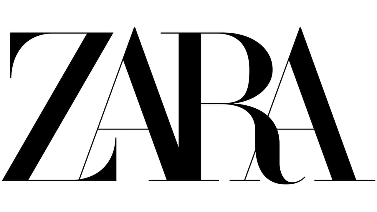
ZARA's new logo is a disaster of legibility.

2. Not taking flexibility into account
Your logo needs to be adaptable to different formats and sizes. Make sure it can be used on different media, such as business cards, websites, advertising banners, etc. To guarantee your logo's flexibility, opt for a simple, minimalist design that will be easy to reproduce on different media.

The Olympics 2012 logo in London. A disgrace of branding.

3. Ignoring sustainability
Your logo needs to be durable and not go out of fashion quickly. Avoid passing trends and opt instead for a design that will remain relevant over time. To create a long-lasting logo, opt for a timeless, clean design that won't be affected by changing trends.
PwC is one of the world's leading professional services firms.

4. Copy other logos
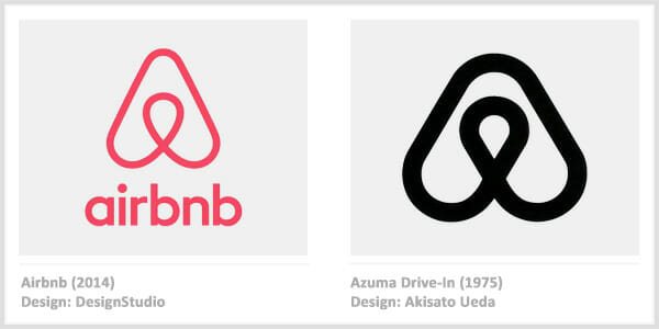
Don't copy other logos, as this can lead to copyright problems and a bad reputation for your company. Create an original logo that reflects your company in a unique way. Take the time to think about what you want your logo to represent, and hire a professional graphic designer to create it.


5. Ignoring your target audience and being out of context
Your logo must be adapted to your target audience. Make sure you understand your audience's preferences and expectations before creating your logo. If your company targets a younger audience, for example, your logo will need to be more modern and innovative, while an older audience may prefer something more traditional and classic. If you don't take your target audience into account when creating your logo, you run the risk of failing to achieve your communication objective and attracting the wrong people to your company.

The Tour de France logo has been relocated, evoking a beach event. Visually, it seems to be aimed at a young, party-loving public. What's more, it doesn't take into account the sometimes capricious weather in France.

6. Ignore simplicity
A simple logo is often the easiest to remember and the easiest to reproduce on different media. Avoid overloading your logo with too many details and opt instead for a streamlined approach. A minimalist logo can be very effective and memorable if well designed.

The illustrated Vaillant logo is too complex.

7. Disregard typography
Typography is an important element of your logo and can say a lot about your company. Choose a font that reflects your company's image and is suitable for your target audience. Avoid fonts that are too ornate or difficult to read, and opt instead for simple, legible fonts.

Champion is a brand American sportswear. The improvised "C" in this logo doesn't work at all with the rest of the typography.

8. Disregard color
Color is an essential element of your logo and can have a considerable impact on your company's image. Choose colors that reflect your company's image and are appropriate for your target audience. Avoid using too many different colors in your logo, opting instead for a maximum of three that complement each other well.

Fuddruckers is a franchised American fast-food chain specializing in hamburgers.

9. Ignore legislation
Check that your logo does not violate trademark or copyright laws. If you use copyrighted elements, or if your logo is too similar to an existing one, you could find yourself in a tricky situation. Call in an intellectual property lawyer or a professional graphic designer to make sure your logo complies with the law.

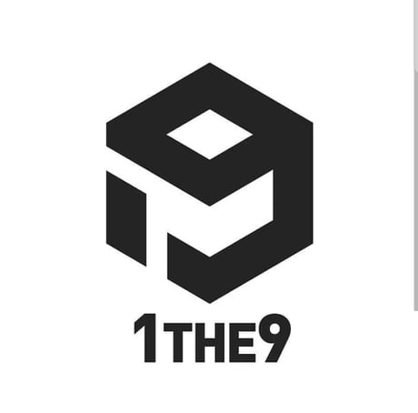
1THE9 used the "9" from 9gag to create their logo.

10. Do not call in a professional
If you have no design skills, it may be tempting to create your logo yourself. However, entrusting the creation of your logo to a professional can ensure a superior result. A professional graphic designer will have the knowledge and experience to create a logo that reflects your company in a professional and consistent way.

Logos created by your nephew.
In short, by avoiding these 10 common design mistakes, you can create a professional, quality logo that will reflect your company and help you achieve your communication objectives. Take the time to think carefully about your target audience, the image you want to portray of your company and how you want your logo to be used. Don't overlook the importance of simplicity, typography, color and legislation, and don't hesitate to call in a professional graphic designer to ensure a top-quality result. A well-designed logo can be a valuable asset for your company and help you stand out from your competitors.


